Communication without words Responsive Web design

Expressive design for your website

We are passionate about developing digital experiences that inspire and empower users. Our UX/UI design services are focused on helping you create user-friendly and highly functional digital products that leave a lasting impression.

Check

Focus on the user

In everything we do, the user is at the center of everything we do. With our thorough user testing, each of our design decisions can be determined by the needs, preferences and expectations of the target group. Intensive research into potential target groups helps us to do this. In this way, we generate a better understanding of those who will end up using the website.
Check

Seamless user journeys

Our team stands out by designing intuitive user flows and information architectures that guide users effortlessly through the website. We optimize navigation and ensure that users find what they need, where they expect to find it.
Check

Eye-catching visuals

We carefully select colors, typography and visual elements to create an appealing and consistent design that reflects the brand's identity. You will receive a detailed manual in which these visuals are recorded.
Check

Mobile-first and responsive design

55% of online visits worldwide are made via mobile devices. That's why we know how important responsive design is. Our designs are optimized for screens of all sizes and offer a consistent user experience on all platforms. We always follow the mobile-first approach.
Check

Accessibility

Making the digital world inclusive is our top priority. We value accessibility so that your products can be used by everyone, regardless of their disability.

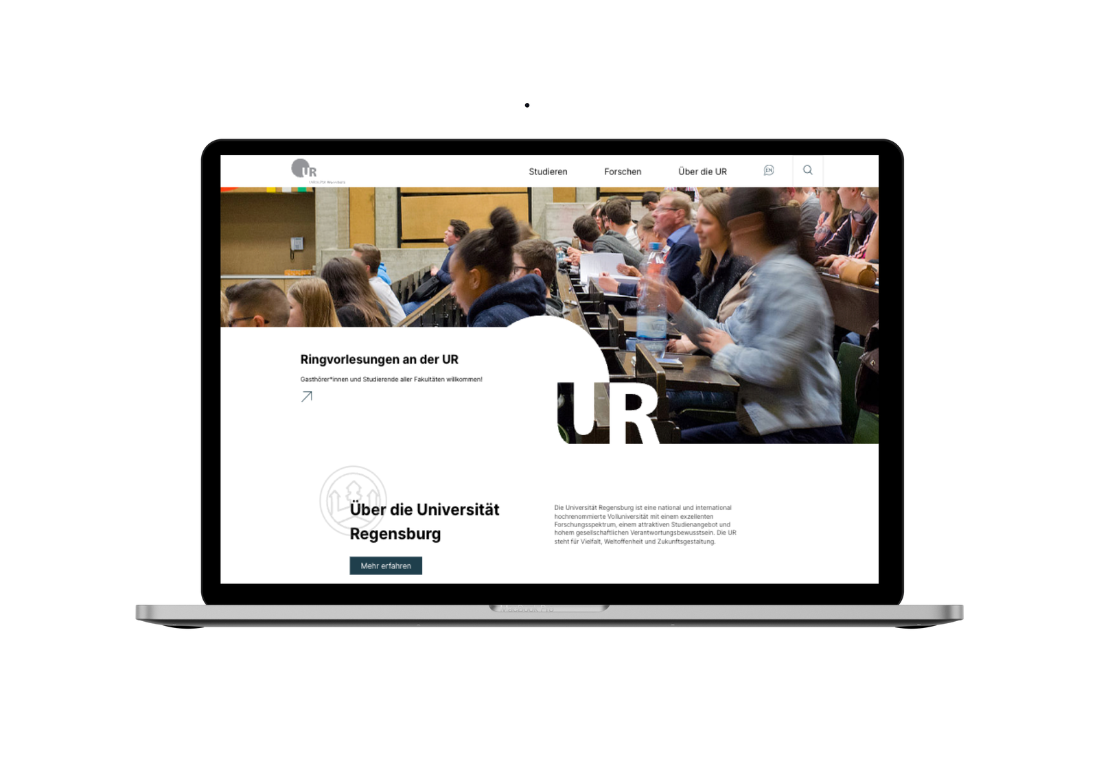
New homepage for the University of Regensburg

As the website of the Universität Regensburg had not been updated for many years, it was time to refresh the first impression. The focus was on large typography, clear elements and a simple, modern choice of colors. The research portal was also given a new look and was additionally equipped with vertical navigation to make it easier for users to access the relevant content.

Mobile first for Seeburger

Right from the start, the main focus was clear: Seeburger's website had to work on all common end devices. Especially on the smallest ones. That's why we followed the mobile-first approach in the design process. This means that the design is first created in the mobile viewport and then adapted to the growing viewports (tablet/desktop). This makes the website easier to use on a smartphone. A clear structure is important here, which was also particularly important to the customer from the outset. The result is a self-explanatory user interface that looks appealing and, above all, professional.

Design workshop

In a workshop with the client, we collect and analyze ideas and inspiration from different perspectives to determine the direction of the design. It is important to pay attention to the defined capacities and goals. We therefore recommend holding the workshop only after the objectives have been developed. This way, you have already set the necessary limits in advance and can create a suitable and appealing design within these limits.

Anna Obermair

Do you have any questions about our design services?

Anna Obermair will be happy to answer your questions!

Anna Obermair  |  Media Design